Continued from here.
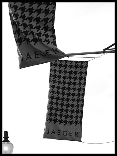
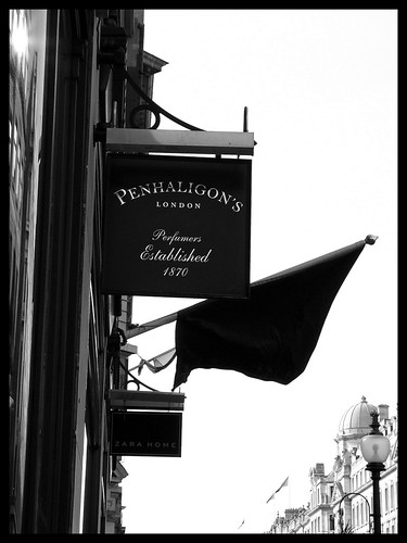
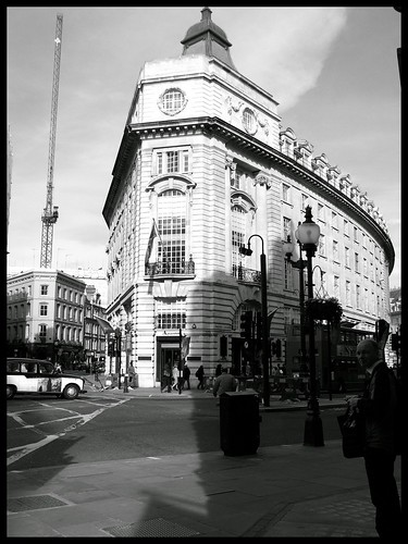
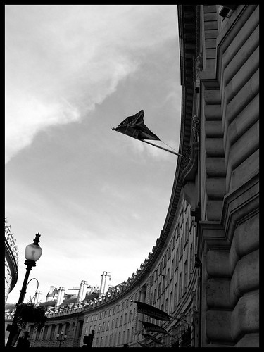
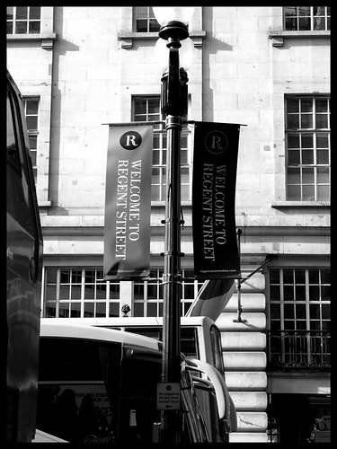
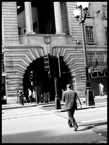
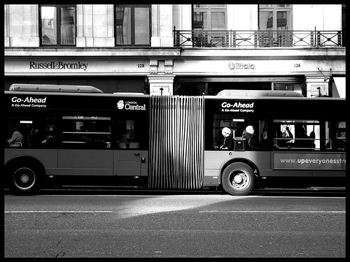
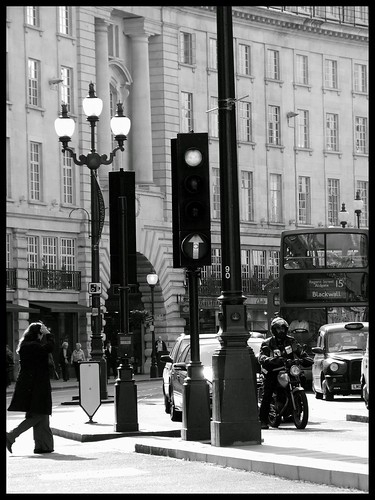
Regent Street was designed in the early 1800's by the great British architect John Nash, as a compliment to the Prince Regent. It has since, for the most part, been identified as the physical and metaphorical heart of London's social scene. Over time it has evolved into one of the most iconic shopping streets in Europe - more so, under the control of the Crown Estate, who took over Regent Street in 2001 and converted it into a brand.
Regent Street was designed in the early 1800's by the great British architect John Nash, as a compliment to the Prince Regent. It has since, for the most part, been identified as the physical and metaphorical heart of London's social scene. Over time it has evolved into one of the most iconic shopping streets in Europe - more so, under the control of the Crown Estate, who took over Regent Street in 2001 and converted it into a brand.






7 comments so far:
Wonderful your photographies, will visit to you assiduously
I like the use of black and white. Must have looked good in colour too. But why did you choose to keep it in BW?
Charly Morlock: Thank you! Incidentally, I'm about to visit your beautiful country very soon:)
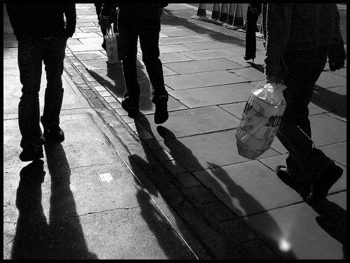
SloMo: As I said, I think black and white is more timeless, and it works well with street photography, where you want to highlight a particular subject without colour distracting from it. The only other time I've done black and white is in Meerut, India - some 4 years back. (Click Meerut in the tags section on the right). Wanted to experiment with BnW on a street scene in London and here I am. Would love to hear your views on whether it works or not - and how I could improve. :)
however cliched this may sound, my vote-> thumbs up to b&w for street photography:)
nice frames...4th and 9th from the top are lovely!
Well the choice of B&W vs Colour are just as important as say maybe the frame? So often in post-processing, the frame can make such a difference in the impact the image has on the viewer. Of course in addition to the subject :-)
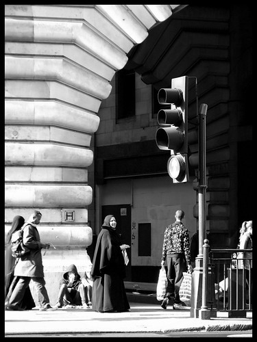
ooooooooooo... loved the shot of the traffic signal.. the arch, and the woman clad in a burkha..
Jyothy: Thanks! :)
Post a Comment
Thank you for your comments. I really cherish your feedback and discussion!